Microsoft Word: 20 years and still wrong
After twenty years — twenty years! — Microsoft Word still can’t do the most basic of its selling points: Placing graphics into text. (Note: I am using Office XP, which puts me a rev behind.) For almost twenty years, I’ve been trying to tell Word where I want graphics laid out. Word still won’t listen to me.
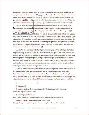
I want my page to look like this:

But, after twenty minutes of trying, this is the way Word keeps insisting I want my page to look:

That happens to be with the layout set to top-and-bottom, but it’s what I get for various other layouts. If I drag the image where I want it, it bounces back to the top of the page where the top portion would be cut off if I tried to place it. Sometimes it bounces onto a new page entirely and I have to go hunting for it.
If I set the layout so that it’s inline, I get this:

Here’s a closeup:

No, it doesn’t help to create a drawing canvas first. All that does is limit the number of layout options Word can get wrong. Aaarrrggghhh!
I used to work for Interleaf. We were getting this right in 1986.
[Tags: MicrosoftWord annoyances microsoft]
Gaspar Torriero has discovered at least part of the problem. He writes in an email:
As I suspected in the comments, your document “Normal” style has the
line height set to “exactly” 18 points.So when you insert an inline image which is taller than that, Word is
by design (and stupidly) sticking to that value and will not adjust
line height to suit the image. That is your problem. And in fact Word
is showing you the bottom 18pts of it…To solve the problem, provided you do non want to revert to standard
line height, you should:– insert new line
– modify Format -> Paragraph -> line spacing to “single” for that line
– insert inline image: line height will adjust accordingly
– everybody is happy
Well, we’re all happy except those of us who are chagrined because it turns out to have been our fault.
Nevertheless, based on 20 years of frustration and the weird transparency issue in the screen captures, I maintain that Word’s graphic placement is hinkey.
Thank you, Gaspar!
Categories: Uncategorized dw


